Demand Beacon’s Portfolio
The Community Space
The Community Space Website Redesign (Squarespace Build).
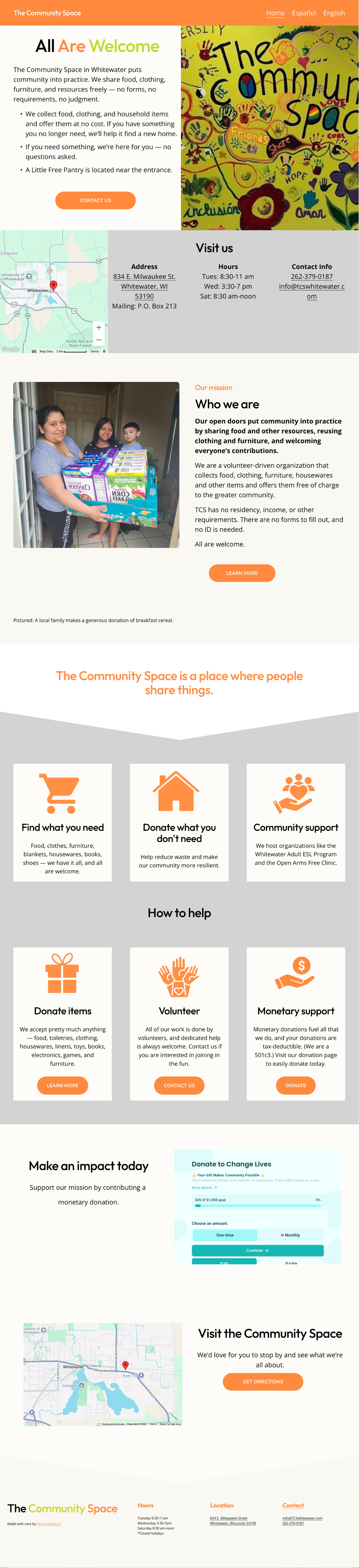
The Community Space does something pretty incredible — they share food, clothing, household items, and support with their community. No forms. No income requirements. No ID. No judgment. Their website needed to reflect that same energy: open doors, zero barriers.
What they had wasn't doing them justice. The old site was disorganized, outdated, and a pain for their volunteer team to update. And when your hours, donation needs, and programs change regularly, you need a site that keeps up — without requiring a dev on speed dial.
So we rebuilt the whole thing in Squarespace and gave them something that actually matches who they are.
What We Did
Website Strategy · UX/UI Design · Content Architecture · Full Site Build · Visual Direction · Mobile Optimization · Bilingual UX
The Build
We designed a warm, dual-language website that feels like The Community Space the second you land on it — welcoming, clear, and built for everyone in the Whitewater community.
Here's what went into it:
Dual-Language Experience (English + Español): Full bilingual site — every page, every section, every CTA. Visitors can switch languages instantly. This community is diverse, and the website should reflect that without question.
Hero Section: A bold "All Are Welcome" message paired with real imagery from their space. It sets the tone immediately — this is a place of openness and care.
Clear Mission + Who We Are: We rewrote their mission statement to hit harder and communicate their no-barrier approach upfront. No forms. No income check. No ID. Just come in.
Visit Us Section: Address, hours, contact info, and a map — all in one clean, easy-to-find block. No hunting around.
How We Help + How to Help: Two sides of the same coin, laid out clearly. What the community can receive (food, clothing, furniture, household goods) and how people can give back (donations, volunteering, financial support). Both paths are simple to follow.
Donation Integration: A clean, user-friendly donation module. If someone wants to support TCS, we're not going to make them work for it.
Photo-Rich Storytelling: Real volunteers. Real community members. Real moments. Stock photos have no place on a site like this.
Modern Iconography: Custom icons to organize information visually and make everything scannable at a glance.
Mobile-First Layout: Most people checking hours or location are doing it from their phone on the go. We built for that reality first.
Why Squarespace
This is a volunteer-run organization. Their old platform wasn't built for that — every small change was a headache. Squarespace lets their team update hours, swap photos, edit donation lists, change announcements, and add or remove content blocks on their own. No developer. No waiting. That's a game changer when you're running on heart and hustle.
The Result
The new Community Space site is bilingual, mobile-friendly, welcoming, and — the big one — actually manageable for a volunteer team. Donors can find what they need. Families can find what they need. And the people running the show can keep it current without calling us.
We didn't just redesign a website. We gave them a digital front door that feels exactly like walking into The Community Space — warm, open, and ready for whoever shows up.